Astronomy | GXR · GR · RX100 M1 · RX100 M4 · RX10 M3/4 · TZ202 · X Vario · M240 · General | Photos | Conf. Places | Calendars | Art
Leica X Vario: Design Issues
Colors on Dials | Dial Labels | Direction Pad | Rear Buttons | Grid Display | Shooting Videos - Unwillingly | Shutter Button | Lens Rings | Protector | Conclusions | Addendum: What Other Users Say... | References
Archive
While I love my Leica X Vario, the Leica engineers also made a number of design decisions that, as a previous software usability professional, I find, at least, questionable. Others may have a different opinions on this, but on this page I would like to list what I find "improvable" from a design point of view (not a functional one - see the notes below). Of course, you may question whether something can be regarded as a design or a functional issue. I list missing features here, that is, as design issues, because they are not included in the design...
Note: I added comments with regard to firmware update version 1.1 (15 September, 2014). See page Firmware for details.
Overview
I discuss the following design issues (or non-issues...):
- Colors on Dials
- Dial Labels
- Direction Pad (INFO Button, Materials, Labels, Unused Position)
- Rear Buttons
- Grid Display
- Shooting Videos - Unwillingly
- Shutter Button
- Protector
Notes
- I deal with functional issues on page Functional Issues.
- I deal specifically with with autofocus (AF) issues on the following pages: Functional Issues - Autofocus (Introduction), Functional Issues - Autofocus (Real World Photos), and Functional Issues - Autofocus (Test Photos).
Colors on Dials
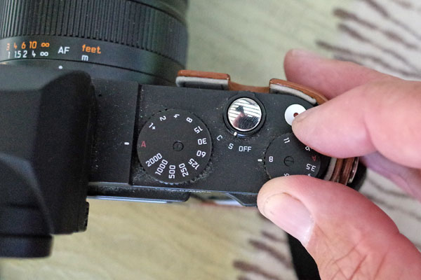
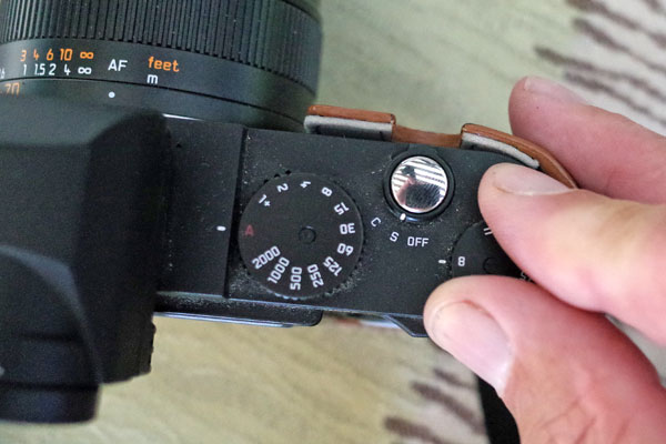
The Leica X Vario has two dials on top, the aperture setting dial and the shutter speed dial. Used in combination, both make handling the camera very direct and easy. But in my opinion there is one problem with the dials: On both dials, the "A" (automatic) settings is colored dark red. First of all, red is a color that usually is used for warnings. Thus, Leica seems to want to warn us of using the "A" settings. I am not sure whether they really meant to do this, but why not use green to indicate that these are the preferred, "idiot" settings?
There is a more severe reason behind my criticism, though: In low light, the red "A" becomes more or less invisible, and particularly the aperture setting dial with its different distances between f-stop settings become unusable. Of course, you may look through the viewfinder or at the LCD screen when turning the dials, but one large advantage of the X Vario is that you can turn the dials without turning the camera on. So why not mark the "A" settings in light green, which is the color we can see best - even in low lighting???
For your convenience, here is a fake proposal (right) with green "A" symbols:
 |
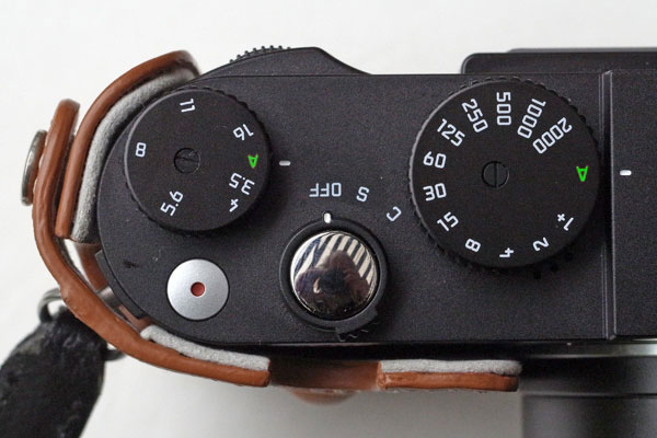 |
Figures: Even on this photo in fairly good lighting the "A" symbols are hard to see (left). The green "A" symbols are - in my opinion - much better to see (right)
Dial Labels
Some users reported that the labels on the dials for shutter speed and aperture wear off (see photo below). This issue is not confined to the Leica X Vario, but seems to be a "general" Leica camera issue. The labels are simply painted on the dials, and after some time the paint wears off. It would be better to engrave the labels into the dials (which are probably made of plastic), but that seems to be too expensive for "budget" cameras like Leica cameras. Luckily, my sample does not suffer from this issue yet...
By the way, in his review of the Leica X Vario, Petapixel's Nelson Tan writes: "The letterings are silk screened instead of being engraved, which I find slightly disappointing." Thus, the fact that the labels are not engraved does not only to seem to disappoint some people, it is a potential and thus, a design issue.
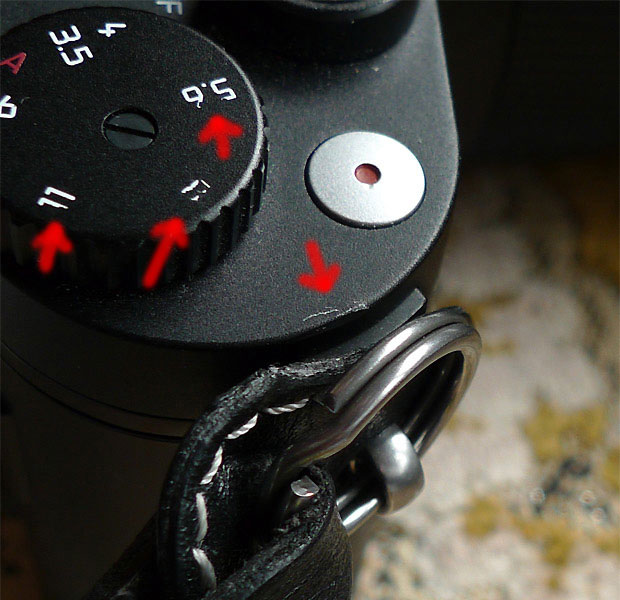
Photo: "Vanishing" labels on aperture dial and scratches caused by the metal ring from the leather strip (original Leica wrist strap) (click photo for larger version )
Direction Pad
INFO Button
Update
With firmware update version 1.1 (15 September, 2014), the INFO button behaves like the MENU/SET button in case that settings need to be confirmed, allowing one-handed interaction. This is definitely an improvement, although a button arrangement as used for the X2 or the new X and X-E would have been preferable (because it is more consistent). Anyway, I am delighted with this improvement and hope that there will be no conflicts between the buttons (I did not find any so far...).
Original Text
A lot of people already criticized this: Leica has moved the MENU/SET button from the center position of the direction pad to the bottom position in the row of buttons at the left of the camera back (se Figure below). This repositioning contradicts the way most cameras implement this. It is also different from the Leica X2 (and X1) layout, on which the X Vario is based.
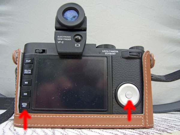
Figure: Direction pad with "INFO" button on the right of the camera back; rear buttons with "MENU/SET" button at the bottom
I do not know why Leica changed this, but I have an idea now... First, I thought that they wanted to prevent people from hitting the "MENU/SET" button accidentally. But after having a look at the Leica M 240 on the Leica Website, which has the same arrangement, I assume that the change was made because Leica wanted to make the X Vario resemble more closely the M (in the same vein, they redesigned the camera's top plate).
With the "new" (or M-style) layout, people now need two hands to change and confirm settings. For me, this is especially inconvenient, because I support the lens with my left hand. Confirming settings means that I need to move my left hand in order to press the MENU/SET button.
Perhaps, I should illustrate the meaningfulness of Leica's placement the "INFO" and confirmation ("MENU/SET") buttons with an anecdote that I came across in the dpreview.com Leica forum. A new X Vario owner reported that he had shot in JPEG the first day, although he was convinced that he had set DNG+JPEG. He did not know why that had happened and speculated about some "mysterious" reset of the settings. Another poster, a true X Vario ambassador, replied to this posting and confessed that the same thing had happened to him as well - and he suggested why (guess what - the placement of the buttons)... Both photographers were, of course, "predispositioned" by their previous cameras, which had the "usual" arrangement of the "SET/OK/confirmation" button at the center of the direction pad...
Leica could change the behavior - or make it selectable - with a future firmware update. They might also offer replacement buttons for people who would like to change the arrangement. But I doubt that this will ever happen, particularly considering that they strive for a resemblance with the Leica M. So, I am only dreaming...
Materials, Labels
By the way, I personally do not understand why the direction pad is in silver and made of plastic(!). That looks cheaply made, indeed...

Figure: X Vario direction pad (plastic with silver coating)
And if it has to be in plastic, why can't it be black and have white labels as with the Leica X2 (see Figure below)? The "relief" labels aren't easy to see at all (see Figure above), particularly in low light. As already indicated by the red "A" labels, accessibility does not seem to be a strength of Leica engineers...
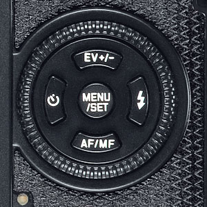
Figure: Leica X2 direction pad in black with white labels - and with a function in the "down" position
Unused Position
In his review, Eugene Fratkin points to the fact that one position on the direction pad is unused, namely the "down" position. On the Leica X1 and X2, this position is used for switching between autofocus (AF) and manual focus (MF) (see Figure above), but on the X Vario this function is no longer needed there because you do this by turning the lens's distance ring. But shouldn't it be possible for Leica to find a useful function for this position? Well, if Leica were Ricoh, they would call it "Fn1" and would allow you to assign a number of functions to it. I will leave it at "FN" for the moment (see Figure below):
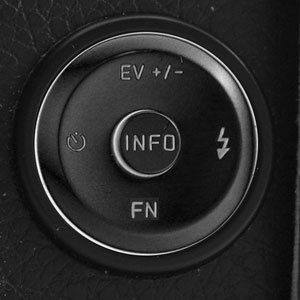
Figure: Proposal (mockup) for a black direction pad with white (or gray) labels and an "FN" function for the unused "down" position.
Here is a quick and subjective selection of functions that might be assigned to the new "FN" button:
- MF Assist
- Image stabilization
- Play on Monitor
- Menu on Monitor
- Auto Review
- Wind Noise Cancellation
- Acoustic Signal
- And many more...
Rear Buttons
Most people whom I hand the camera over to, accidentally press the rear buttons when the camera is turned on, when they grab the camera with their left hand. Since I usually support the lens with my left hand, I do not hit the rear buttons too often by accident, but still more often than I would like... Luckily, most settings require another button press to make changes. So, typically you can rid of the menus that appear by simply pressing the MENU/SET or any other button on the left.
I know that many DSRLs have a similar button layout, but being a Ricoh user, I am not used to it. For people who do not support the lens with their left hand, this really is an issue.
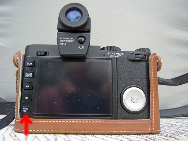
Figure: Rear buttons on the left of the camera back
See also the Protector below, which according to a number of users, helps avoid touching buttons inadvertently.
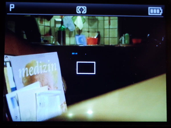
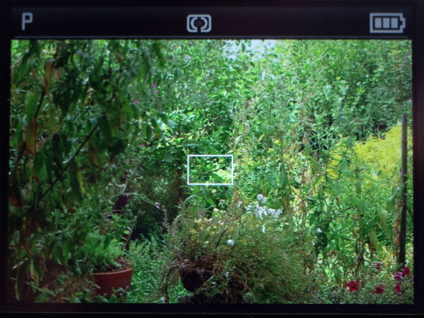
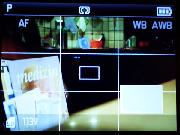
Grid Display
Using the "INFO" button, you can scroll through three variants of the display (either LCD monitor or EVF):
- Only basic exposure settings, as well as AF and exposure metering methods are displayed
- Like (1), but with additional information in two semi-transparent bars at the top and bottom of the screen (I call this "full" information), plus a histogram, if set in the menu
- Like (1) plus a grid (creating nine fields) and plus a histogram, if set in the menu
 |
 |
|
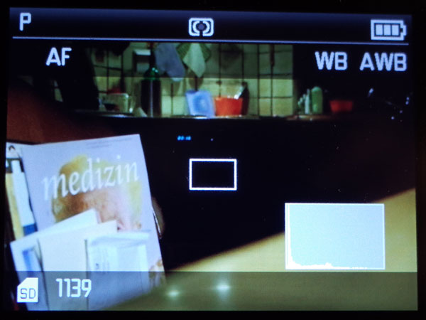
Variant 1: Basic display before pressing the shutter button (Auto ISO) |
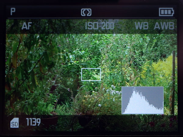
Ditto, ISO 200 |
|
 |
 |
|
Variant 2: "Full" display (Auto ISO) |
Ditto, ISO 200 |
|
 |
 |
|
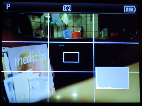
Variant 3: Variant 1 + Grid (Auto ISO) |
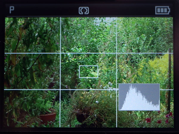
Ditto, ISO 200 |
My gripe with this selection is, that I often use the third variant (because the grid allows me to align the camera along straight lines), but this variant leads me to take photos with wrong settings, because these are not displayed as in variant 2. Such failures happen, of course, most often when I am in an hurry... The two things that I have typically set incorrectly are ISO and focus (typically MF instead of AF):
- I often increase ISO when I, for example, visit a church or other buildings. Usually I reset ISO afterwards, but often enough, I forget to do so. "Suboptimal" images at ISO values between 1600 and 6400 are the result... Would the ISO value appear in the display, as in variant 2, I might have noticed my error...
- Sometimes, I use MF for focusing scenes where AF has difficulties (often, I just set the focus to infinity). As with ISO, I often forget to reset the camera afterwards. In addition, when the camera hangs around my shoulder, the distance ring may be turned inadvertently. An infinity value would not be too bad in many situations, but a closer distance is often a bad choice, resulting in unusable photos. Of course, one might argue that a quick look at the distance scale would reveal that the focus is set to MF. But often I am in a hurry, do not look at the camera, and just shoot. If the "MF" symbol were visible in the viewfinder, I would realize my mistake at least sometimes...
I became fully aware of these issues on a vacation - and, regrettably, quite a few photos were lost or were suboptimal "thanks" to the missing viewfinder information. A "perfect" solution would be to offer the grid not only in addition to variant 1 (basic information) but also in addition to variant 2, that is, with "full" information.
 |
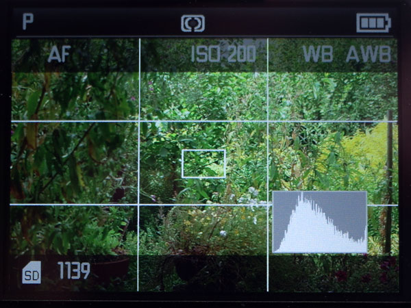 |
Figures: Additional grid display variant with "full" information (mockup) - Auto ISO (left) and ISO 200 (right)
This issue* can, of course, be easily remedied in software with a firmware update. Here are two approaches to how you can also add the grid to the "full" information:
- Add a fourth variant ("full" information plus grid) to the sequence of displays through which the "INFO" button cycles. This approach does not require any changes in the camera menus.
- Add an option to the menu that allows you to add the grid either to the "basic" or to the "full" information. In this case, the "INFO" button cycles only through three display variants.
*) You may decide for yourself, whether this is really an issue. Nevertheless, such a design change would help avoid errors and thus can be regarded as "user friendly."
Shooting Videos - Unwillingly
Admittedly, I use the Leica X Vario's video function very rarely. From time to time, however, I use it - unwillingly. This is typically the case, when I decide to set the aperture manually and to turn the aperture setting dial. The photo below shows that the video shutter button is close to the dial and that you can easily touch it:
When I turn the aperture setting dial, I often move my finger over the video shutter button and touch and press it inadvertently, as indicated on the next photo:
After a few seconds, I usually notice my error and stop the video...
No one else seems to have complained about this issue - it looks as if I were the only one who experienced it. Nevertheless, I believe that, with a little more thinking, the video shutter button could have been better protected against inadvertent presses...
Shutter Button
Every other month, typically when I am vacation, the X Vario's shutter button shows a tendency to get a little stuck from time to time (sometimes every other shot, sometimes after a larger number of shots). When I release the button, it takes a short moment until the button reaches its "off" position again. This is disconcerting and annoying, but since I cannot recognize a system in this behavior (maybe, it happens when I take a larger number of photos), there is nothing I can do at the moment...
Lens Rings (Distance, Zoom)
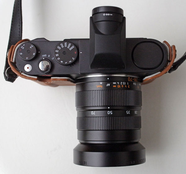
Figure: The two lens rings for setting distance and focal length differ a tiny bit in diameter but have the same "feel"; I therefore often confuse the two when I have the camera at eye-level.
The Leica X Vario's lens has two rings, one for setting the distance (with an option for autofocus), and one for setting the focal length (zoom value). Note that aperture is set with a dial on the top plate of the camera (the left one in the Figure above).
I often confuse the distance ring with the zoom ring (and vice versa) when I have the camera at eye-level. A design with different surfaces for both rings, giving the rings a different "feel", would help avoid confusing them, but probably designers would find this ugly... There is a small difference in diameter between the distance and the zoom ring. But to recognize it you have to move your fingers over both rings...
Protector
Admittedly, the so-called "Protector," a half case, is an accessory, and one might argue that its shortcomings are not camera issues. But somewhere I have to place my thoughts about it...
Overall, the protector is a useful accessory and, as its name says, it protects the camera. I also find the camera easier to hold with the protector thanks to the small "grip" at the front. A number of users also report that the protector keeps them from pressing the rear buttons and the direction pad inadvertently. I did not really test this, but overall would with this...
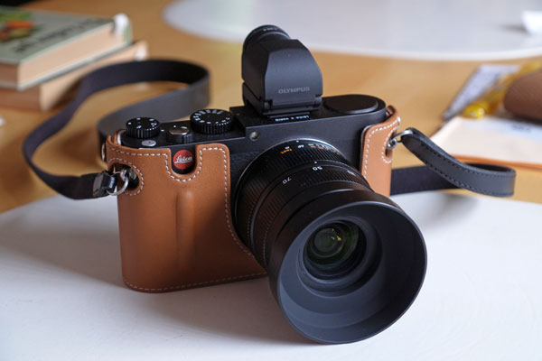
Figure: Leica X Vario with Protector, Olympus VF2-electronic viewfinder, lens hood and shoulder strap
So, what is wrong with it? Firstly, it is not "fixed" to the camera so that it sometimes looses contact" with it. Secondly, you have to remove the protector each time you want/need to remove the SD card or battery, which happens fairly often to me. This is actually the most annoying thing when I use the protector.
Finally, the "clever" marketing gag to punch a whole for the red Leica logo is not to my taste - I would have done without it. For example, it could cause problems in certain countries, where you better conceal the logo in order not to get ripped off your camera. Most thieves will probably not recognize the difference between an X Vario and a "real" Leica (M)... And for certain people, I would also like to hide the logo in order not to be exposed to their lengthy remarks on how "stupid" such an expensive camera is and that their cheap camera is all they (and everybody else) need...
Conclusions
So, here is my list of suggestions for design and/or hardware changes for the Leica X Vario (for the complete list of suggestions, see page Functional Issues). Admittedly, I did not expect Leica to implement any of them. However, in firmware update 1.1, a few things that are important to me were addressed. These are indicated below in red.
Nice To Have Hardware (Design) Changes
- INFO button / MENU/SET button: Allow to exchange
the functionality of this buttons so that the INFO button works as MENU/SET
button, allowing to use the camera with one hand.
Nice addition: Offer exchange buttons so that the user can exchange the buttons if desired (or offer the respective exchange service).
>> Addressed in firmware update 1.1 (the INFO button can also be used for confirming settings) - Direction pad: Make the labels readable, preferably offer white labels on a black direction pad.
- Direction pad: Use the "down" position of the direction pad for an "FN" button and allow users to assign various functions to it in the menu.
- Shutter speed dial, Aperture setting dial: Offer exchange buttons with green "A" so that the user can exchange the buttons if desired (or offer the respective exchange service). Engrave the labels instead of painting them on the dials.
- Lens: Make the "feel" of the two lens rings different so that they are not so easily confused (I seem to be the only user having this problem...).
- EVF: Allow the use of the EVF-4 or a similar higher resolution EVF for easier manual focusing (I know, I am dreaming...). A better EVF may even allow to focus manually without using screen magnification or other focus assist approaches (see Jono Slack's article Using Manual Focus Lenses on the Leica T).
- Display (Grid): Add a display option where the grid is displayed together with "full" information.
- Sensor: Allow the (in-factory) replacement of the sensor for one (maybe, the same otherwise) without an AA filter to improve sharpness at the pixel level (to be on par with the Leica T).
- CPU: Allow the (in-factory) replacement of the CPU for one with more processing power to allow the use of higher resolution EVFs and avoid delays and freezes (and AF issues?) that plague the current version of the camera.
Addendum: What Other Users Say...
I am not the only Leica X Vario user who believes that there is room for improvement on the design / hardware side. Typical complaints and/or suggestions for improvement refer to:
- INFO button / MENU/SET button: Many users would prefer a positioning as
it is on the Leica X2 and as I discuss above.
(>> Addressed in firmware update 1.1 (the INFO button can also be used for confirming settings) - Rear buttons: Many users reports that they hit buttons on the camera back inadvertently. Some users report like me that the protector helps a bit...
- External electronic viewfinder: Many users would like to have an in-built electronic viewfinder. I would only agree if the in-built EVF is tiltable, because I use it often 90 degrees titled.
- Labels on dials that wear off (only affected users...): I can understand these complaints...
- Direction pad: Some users complained about the direction pad being made of plastic...
- Automatic monitor shutdown: A user wants to have an "undefinite" option added to the menu list, because activating the camera from "sleep" takes some time, and you may loose valuable shots. This looks useful to me, but of course "wears" on the battery...
Recently, I found a review by Eugene Fratkin (Leica X Vario review) who had quite a few interesting remarks on the X Vario's user interface, among other the (under)utilization of the click positions on the direction pad and of the thumb wheel. I do not want to replicate this here, but would like to refer interested readers to his review.
References
- Eugene Fratkin: Leica X Vario review (fratkinphoto.blogspot.fr/2014/06/leica-x-vario-review.html)
- Jono Slack: Using Manual Focus Lenses on the Leica T (www.slack.co.uk/2014/Leica_T_Manual_Focus.html)
- Leica forum on dpreview.com: www.dpreview.com/forums/1038
- Posting First day with the X-Vario (HuntingSand): www.dpreview.com/forums/post/53238831
- Posting Re: First day with the X-Vario (Rodrigue Zahr): www.dpreview.com/forums/post/53239007
- Nelson Tan, Petapixel: Leica X Vario Defies Naysayers with Impressive Optics (petapixel.com/2013/06/16/review-leica-x-vario-defies-nay-sayers-with-impressive-optics/)
|
made by |
| 19.11.2021 |